A picture paints a thousand words – visualising your data for better understanding with ServiceTracker Reports and Dashboards
This statement is very true and no more so than when you’re trying to figure out the best way to present your business data to both your customers and internally within your teams

With unfathomable amounts of new data being created daily, modern pest businesses are trying to take advantage of as much valuable information as possible. This information can then be used to refine internal company processes to improve productivity, and to more successfully enable customers to make key business decisions using their own data in graphical format.
However, as more and more data is captured and analysed, it becomes increasingly difficult for pest businesses to accurately gain a succinct overview of what that data is telling them.
Here’s an example for you on how ServiceTracker reports and dashboards can significantly help your business. How much time do your admin teams currently have to spend deciphering the technicians’ check lists after completing BRC visits, typing it into Excel and then creating graphs from the data? We know how time consuming this is which is why this is all automated within our reports and dashboards. All your technicians have to do is type the analysis data into their mobile and the customer can see the graphs straightaway.

But how can I use all the information captured to improve the productivity of my internal teams?
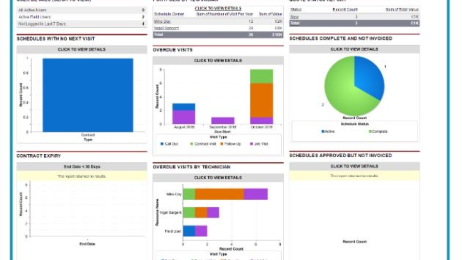
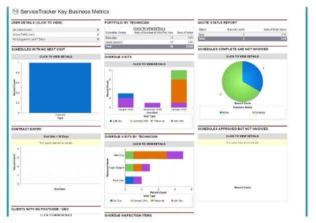
ServiceTracker is already packed with reports which your Service Managers amongst others will love. Managing State of Service just got a whole lot easier. You’ll know exactly how a technician is progressing with their routines just by looking at these reports. There’s absolutely no need to ask the techs to come in with all their cards any more!
Timesheets is another great example of a report that can easily be automated and emailed to you on a daily or weekly basis. All you have to do as a manager is to ensure the techs click “Start Work” on the mobile at the beginning of the day, complete all their visits during the day and “Finish Work” at the end of the day. You will then have a fully fledged automated timesheet for your whole team
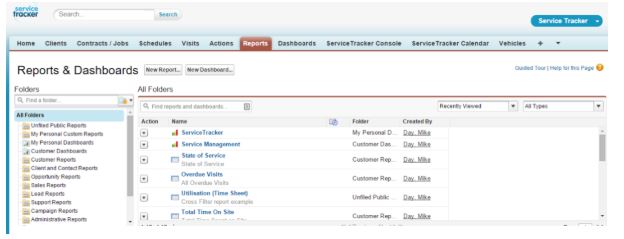
Plus, you can create new reports at the touch of a button – or just ask us to create them for you if you prefer. If the information is being captured, it can be reported upon in any way you wish!
So Dashboards make everything more visual right?
Yes that’s correct. Every pest business that comes onboard at ServiceTracker gets all the great Salesforce Reports and Dashboards out of the box. A dashboard is simply a visual report that offers a solution. By condensing multiple reports down into visuals, such as graphs, charts, tables, and metrics, and displaying those visuals on a single page, analytics dashboards allow business decision-makers to review significant amounts valuable information at a glance.
Do you want to know more?
Get in touch with us now on 033 022 31022 or email info@servicetracker.uk.com